Design System
Internal reference
Design System
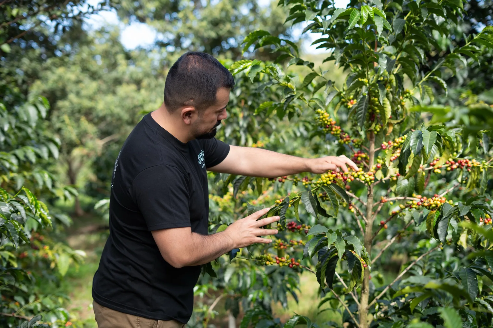
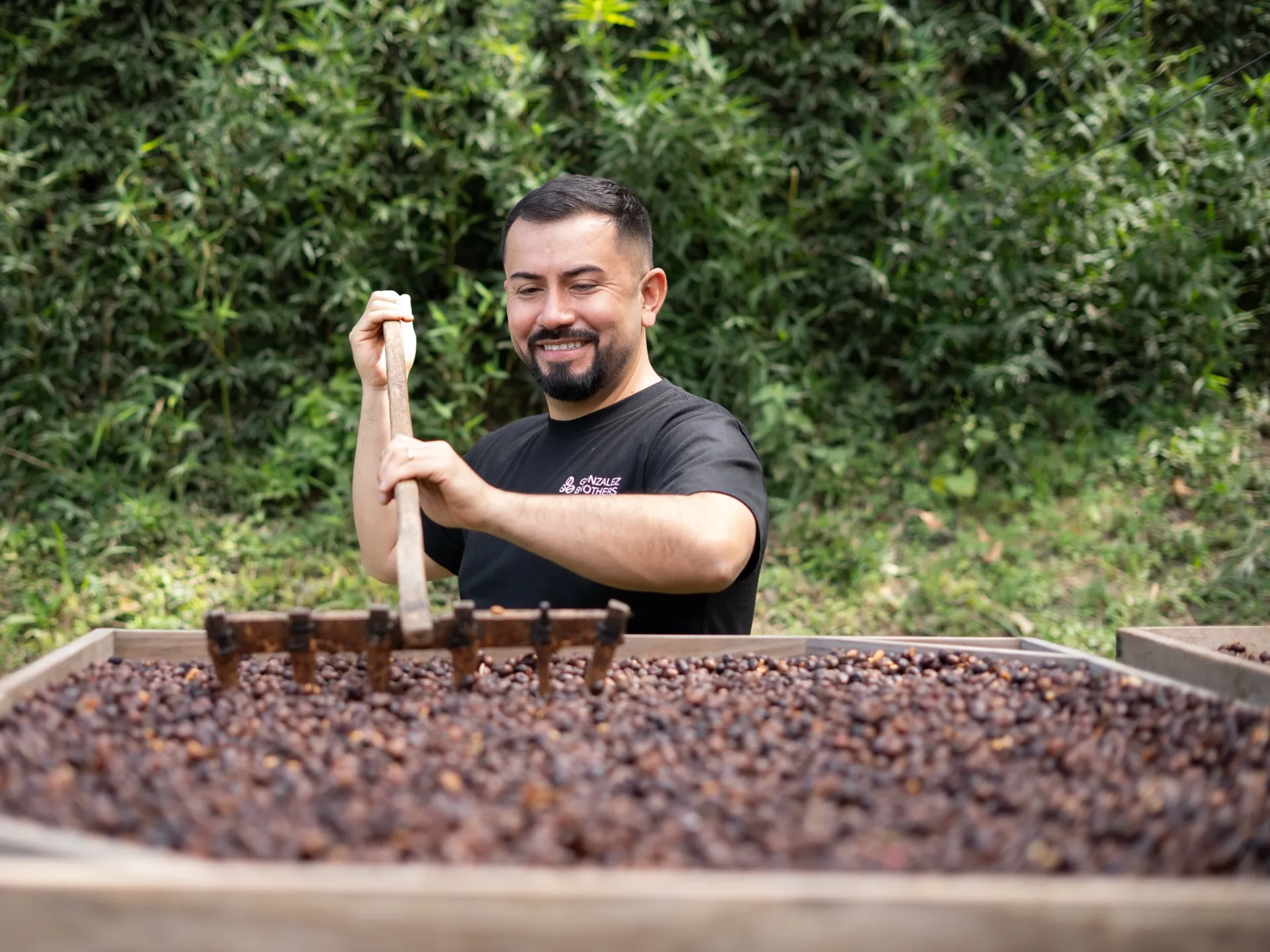
Organic/artisanal direction — like a coffee farm journal meets modern specialty importer. Every element should feel warm, editorial, and distinctly not AI-generated.
01
Colors
Warm cream base with a coffee lifecycle palette. oklch color space throughout. The terracotta accent is the primary editorial action color.
Backgrounds
background
oklch(0.98 0.025 90)
card
oklch(0.97 0.02 88)
secondary
oklch(0.95 0.03 85)
foreground
oklch(0.12 0.01 250)
Coffee Lifecycle Palette
coffee-green
Soft Sage
coffee-parchment
Calm Crema
coffee-light-roast
Warm Latte
coffee-dark-roast
Deep Espresso
coffee-cherry
Soft Mocha
coffee-purple
Mild Cocoa
coffee-terracotta
Editorial Accent
Semantic Tokens
primary
= coffee-cherry
accent
= coffee-light-roast
destructive
muted
border
ring
02
Typography
Playfair Display for headlines (editorial, emotional). Instrument Sans for body (warm, humanist).
Headline — Playfair Display
Specialty coffee direct from Ecuador.
font-serif / 400–900 / Variable woff2
Body — Instrument Sans
Three brothers, one mission — traceable specialty coffee direct from partner fincas in Ecuador to roasters and cafes across the UK and Europe. Every lot scores 84+ on the SCA scale.
font-sans / 400–700 / Variable woff2
Heading Scale
text-5xl serif
Why roasters choose us
text-4xl serif
Three brothers, one mission
text-3xl serif
Ethically sourced
text-2xl serif
Farm & harvest
Labels & Body
eyebrow
What we stand for
body
Every lot comes directly from the farmer — no middlemen, fair and transparent terms.
small/meta
Free UK shipping on orders over £100
04
Layout Patterns
Editorial strips, pull quotes, typographic stats. Break the monotony — never repeat the same section pattern twice in a row.
Editorial Strip (alternating image/text)
01
Ethically sourced
Every lot comes directly from the farmer — no middlemen, fair and transparent terms.
02
High quality
Every lot scores 84+ on the SCA 100-point scale.
Pull Quote
In 2025, we founded Gonzalez Brothers Coffee with a clear purpose: to share specialty coffee from Ecuador with the world.
Typographic Stats Row
Dividers
On light: w-16 h-px bg-border
On dark: w-16 h-px bg-primary-foreground/20
Selection Cards
Parallel options the reader picks between (not sequential steps). The whole card is clickable — wrap in an <a> and use group hover to shift border + icon + CTA colour to coffee-terracotta. No circle around icons (those are for timeline steps only).
Step Process
Sequential 3-step process with round icon containers (one of the few places rounded-full is allowed). Stagger animation by 50 ms max.
Step one
Describe what happens first. One short sentence.
Step two
Next step. Keep it parallel in length and tone.
Step three
Final step — the payoff for the reader.
05
Forms
Solid card backgrounds, no blur, no shadow. Sharp corners from global radius.
Input: bg-card border-border/40 hover:border-accent focus:ring-accent/30
Button: bg-foreground rounded-sm tracking-wide uppercase hover:bg-coffee-terracotta
06
Animation
Decay easing on everything. Subtle translateY, no scale. Film grain globally.
Decay Easing
cubic-bezier(0.16, 1, 0.3, 1)
Physics-based deceleration. Fast start, gentle stop. Used on all scroll-triggered animations and transitions.
Fade Up
translateY(16px) → 0, 0.5s
Subtle 16px upward motion. No scale transform. Applied via animate-fade-up class.
Film Grain Texture
Look closely — grain overlay is on the entire page via body::before
body::before
SVG feTurbulence noise, opacity 3.5%, mix-blend-mode: overlay, z-index: 1 (below modals).
07
Banned Patterns
These patterns make the site look AI-generated. They are explicitly banned on landing pages.
backdrop-blur on cards/inputs
Glassmorphism looks AI-generated. Only allowed on HeroCarousel prev/next buttons and dashboard headers.
rounded-full on CTAs/inputs
Pill buttons look generic. Only allowed on avatars, carousel dots, timeline step circles, spinners.
ring-1 ring-border/50 on every card
Identical ring pattern creates visual fatigue. Use border border-border/20 or nothing.
hover:-translate-y-2 (bounce on hover)
The most AI-looking interaction. Use color shifts only.
hover:shadow-xl / hover:shadow-[0_0_50px...]
Glow shadows look machine-generated. No shadows on hover.
Gradient decorative dividers
bg-gradient-to-r from-X to-Y on h-1 elements. Use h-px bg-border instead.
Identical section rhythm
Never use centered-header → card-grid for every section. Alternate between editorial strips, pull quotes, typography-only, and asymmetric layouts.
08
Logo
Four PNG variants (940px wide, transparent background) plus an SVG inline version. Use the subline variant in the footer, the compact variant in headers and navigation.
On Light Background
gb_logo_black.png
940 x 216 — headers, nav
gb_logo_black_subline.png
940 x 368 — larger placements
On Dark Background
gb_logo_white.png
940 x 216 — hero overlays
gb_logo_white_subline.png
940 x 368 — footer
SVG Inline Component
GBLogo.tsx / GBLogo.astro
Inline SVG — inherits currentColor, h-8 default
Usage
Landing header
GBLogo component — SVG, inherits text color
Dashboard header
GBLogo component — same SVG
Footer
gb_logo_white_subline.png — h-12 sm:h-14
Source: /public/images/logos/ (PNGs) + /src/components/GBLogo.tsx (SVG inline)
Master artwork: gb_logo.ai (Illustrator)
10
Icons
Landing pages inline every SVG — no icon-library imports at runtime. For illustrative icons (step processes, selection cards) we copy the path data from lucide.dev and inline it. The dashboard uses lucide-react. No decorative icons — only functional or categorical indicators.
CTA Arrow (inline SVG)
w-4 h-4 stroke-width="2" — animates with group-hover:translate-x-1
Checkmark (inline SVG)
w-5 h-5 stroke-width="1.5" text-primary — used in trust signal lists
Landing pages: inline SVGs only
No icon-library imports in .astro files. Copy Lucide paths from lucide.dev and inline them. Keeps bundle small and avoids a specific icon-set dependency.
Dashboard: lucide-react
Used in shadcn UI components (password-input, back-link). Consistent with shadcn ecosystem.
11
Product Cards
Catalog product cards for B2B green coffee lots. Taller images, flavor descriptors, variety names, and harvest freshness indicators. No bounce hover, no glow shadows.
Grid Card Anatomy
Image: h-40 sm:h-52 lg:h-60 object-cover
Lot Title
Supplier · Geisha, Sidra
87.5
SCA
Process
Washed
Sample
Available
Card Rules
No hover bounce
hover:border-accent color shift only
Sharp corners
Global --radius: 0.25rem, no rounded-2xl overrides
Image hover: subtle zoom
group-hover:scale-[1.02] — not scale-105
Flavor descriptors
bg-primary/8 text-primary, max 3 tags, no rounded-full
Status Pill
Top-right of image. Solid backgrounds only — pills must read over any photo. Dark for in-stock statuses (afloat / spot / at origin), destructive for sold-out. Hidden entirely when in-stock and status is unknown (public/minimal response).
Container: border border-border bg-card hover:border-accent
Image: h-40 sm:h-52 lg:h-60 group-hover:scale-[1.02]
Descriptors: bg-primary/8 text-primary text-[0.65rem]
Varieties: shown after supplier with · separator
Section Spacing Reference
Stats band
py-8 sm:py-10
Content section
pt-20 sm:pt-32
Editorial strips
py-0
Important CTA
py-20 sm:py-32
Utility
py-10 sm:py-14